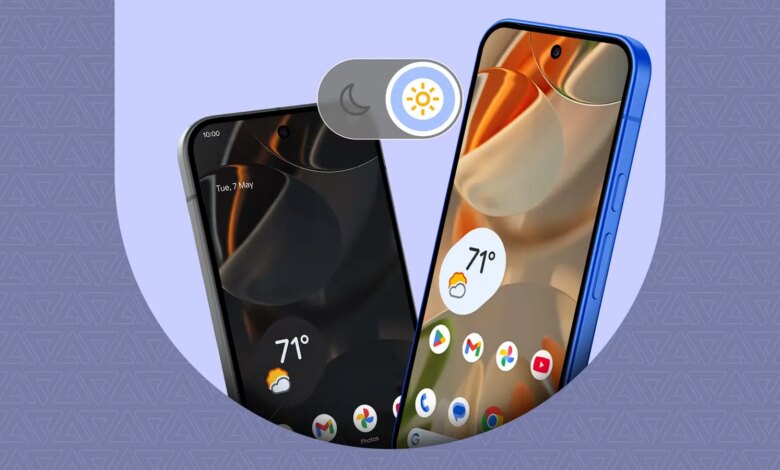


For years — ever since OLED displays became the smartphone standard — I’ve been a die-hard dark mode loyalist on Android.
I always considered it vastly superior to light mode. Whenever I set up a new review device, it’s instinctively one of the first toggles or settings I change.
However, after testing a few new launchers and tweaking the theme on my Google Pixel 9 Pro XL, I decided to take light mode for a spin.
Since then, I haven’t looked back, and I don’t plan on switching back to dark mode. Here’s why I changed my tune.
Dark mode should save battery
But it just cranks up my screen brightness way more

My primary justification for sticking with dark mode was always preserving battery life.
After all, black pixels drain significantly less energy than colored, active pixels in OLED displays. And almost every modern smartphone rocks an OLED or AMOLED panel.
Beyond the punchy colors, the real advantage lies in how these displays handle deep blacks by simply turning individual pixels off, unlike in LCD panels.
So, there’s a perfectly valid reason why many users opt for dark mode in their devices.
Yes, squeezing out a little extra battery juice is great in theory. I can claim a few percentage points over a long day. But in practice, the actual battery savings feel negligible.
I’ve been running light mode full-time on my Pixel 9 Pro XL, and the endurance difference compared with dark mode is barely noticeable.
I still charge my Pixel device with a quick top-up in the morning before heading out and then a full charge at night while I’m eating dinner.
That charging routine hasn’t changed, regardless of which mode or theme I use.
Legibility is better in light mode
It makes everything clearer without putting the slider to max
In a controlled scene, sure, using dark mode might save me 5% to 10% on battery life. However, that advantage is entirely offset the second I step outside.
When using my phone in bright sunlight, I constantly find myself cranking the brightness to the absolute maximum.
I first noticed this glaring flaw while trying to customize my phone into a Kindle-like reading UI.
I found that automatic brightness is remarkably more consistent when I am utilizing a light wallpaper or theme.
The interface remains incredibly legible, which also reduces outdoor glare even at surprisingly low brightness levels.
Conversely, dark mode turns the screen into a mirror. The pitch-black pixels might be disabled, but my app icons and navigation buttons become a washed-out mess, or sometimes unreadable, when the brightness is low.
The screen glare is just too harsh, forcing me to aggressively slide that brightness slider to the ceiling.
I don’t know about you, but reading tech articles is also infinitely more comfortable in line mode or with a sepia-toned background.
Traditional black text on a crisp white background provides vastly superior contrast in well-lit environments. My eyes no longer have to adjust from inky black screens to the bright surroundings when I’m reading.
 Quiz
Quiz
The history of dark mode
Trivia challenge
From phosphor screens to system-wide themes — how well do you know the
shadowy story of dark mode?
HistoryDesignSoftwareDisplaysAccessibility
Early computer terminals in the 1970s and 1980s displayed text on dark backgrounds
by default. What was the most common text color on these classic CRT terminals?
Correct! Green phosphor text on a black background was the iconic look
of terminals like the VT100. The color came from the phosphor coating inside the CRT tube, which glowed
green when struck by an electron beam. Amber was also common, but green became the defining image of
early computing.
Not quite. The most iconic terminal text color was green, produced by
the phosphor coating inside early CRT tubes. Terminals like the DEC VT100 made this green-on-black style
synonymous with computing in the late 1970s and 1980s. Amber was a close second, but green wins the
nostalgia crown.
The shift from dark-on-light to light-on-dark interfaces accelerated in the 1980s
largely because of which influential product?
Correct! The original 1984 Apple Macintosh introduced a graphical user
interface with a white desktop metaphor, mimicking a real-world paper-based workspace. This
light-background design became hugely influential across the entire software industry and set the
standard for desktop GUIs for decades to come.
Not quite. The Apple Macintosh, launched in 1984, was the key catalyst.
Its white GUI desktop was designed to mimic paper and real-world office workflows, and its enormous
cultural influence pushed the entire industry toward light-background interfaces. This made dark
backgrounds seem old-fashioned for the next 30+ years.
Which operating system was the first major desktop platform to officially ship a
built-in, system-wide dark mode as a mainstream user-facing feature?
Correct! Apple’s macOS Mojave, released in September 2018, was the first
major desktop OS to offer a true system-wide dark mode that apps could adopt through official APIs. It
was a headline feature of that release and sparked enormous user enthusiasm, putting serious pressure on
Microsoft and Linux desktop developers to follow suit.
Not quite. macOS Mojave, released in September 2018, takes the crown for
the first major desktop OS with a proper system-wide dark mode. Although Windows 10 had a partial dark
theme earlier, Mojave was the first to provide comprehensive, developer-supported dark mode APIs that
extended across system apps and third-party software alike.
In what year did Android officially introduce a system-wide dark theme as a core
feature of the operating system?
Correct! Android 10, released in September 2019, introduced a
system-wide dark theme for the first time as an official Android feature. Developers could also use a
new API to detect the user’s preference and apply dark mode automatically within their apps, making it
far easier to support across the ecosystem.
Not quite. Android 10, launched in September 2019, was when Google
officially brought system-wide dark mode to Android. Before that, some manufacturers like Samsung had
their own dark mode implementations, but there was no consistent, system-level solution with proper
developer APIs until Android 10 arrived.
Dark mode is often cited as beneficial for users with which visual condition, as
high-contrast light interfaces can cause significant discomfort?
Correct! Photophobia, or light sensitivity, makes bright white
interfaces genuinely painful for many users. Dark mode significantly reduces the amount of light emitted
by a screen, making it far more comfortable for people with this condition. It is also commonly
recommended for people who suffer from migraines, as bright screens can act as a trigger.
Not quite. The condition most directly helped by dark mode is
photophobia, which is a sensitivity or intolerance to light. Bright white UI backgrounds can cause real
pain and discomfort for people with this condition. Interestingly, astigmatism is sometimes cited in the
opposite direction — some research suggests high-contrast white text on black can actually be harder to
read for astigmatic users.
Dark mode offers a genuine battery-saving benefit on smartphones, but only on
screens using which specific display technology?
Correct! OLED screens work by lighting each pixel individually, meaning
true black pixels are simply turned off and consume virtually no power. This makes dark mode a real
energy saver on OLED displays. On LCD screens, a backlight illuminates the entire panel regardless of
what is shown, so dark mode provides little to no battery benefit on those devices.
Not quite. The battery-saving benefit of dark mode only applies to OLED
displays. Because OLED pixels emit their own light and black pixels are fully switched off, showing dark
content genuinely reduces power consumption. LCD screens — including IPS and TN panels — use a constant
backlight behind the whole screen, so dark mode makes almost no difference to battery life on those
devices.
Before Apple introduced an official dark mode in iOS 13, power users could achieve a
system-wide dark appearance on iPhones using which hidden accessibility feature?
Correct! Smart Invert Colors, introduced in iOS 11 in 2017, was Apple’s
workaround before a true dark mode existed. Unlike the older Classic Invert, Smart Invert attempted to
avoid inverting images and media while still flipping the interface colors to dark. It was imperfect but
became a favorite trick among dark mode enthusiasts before iOS 13 arrived.
Not quite. The workaround that dark mode fans used before iOS 13 was
Smart Invert Colors, added in iOS 11 back in 2017. It was designed as an accessibility tool but doubled
as a crude dark mode — it inverted most of the UI while attempting to leave photos and videos untouched.
It was far from perfect but gave users a taste of dark mode before Apple made it official.
According to a widely referenced 2021 study from Purdue University, how much power
could dark mode save on a smartphone with an OLED display at full brightness?
Correct! The Purdue University study found that switching from light to
dark mode at maximum brightness could save between 39% and 47% of screen power on OLED displays. The
savings were less dramatic at lower brightness levels, but the research confirmed that dark mode is a
genuinely meaningful battery optimization on OLED hardware, not just a stylistic preference.
Not quite. The Purdue University study published in 2021 found that dark
mode could reduce screen power consumption by approximately 39% to 47% on OLED displays when the screen
is running at full brightness. The benefit shrinks at lower brightness settings, but it remains a real
and measurable saving — validating what OLED dark mode fans had long suspected.
Your Score
/ 8
Thanks for playing!
Many apps work great with a bright theme
It makes my display an e-paper

Another revelation I had during this experiment is that most of Google’s apps and services work better in light mode.
Apps such as Calendar, Google Health, and Gmail look fantastic on a light background. I can instantly spot calendar entries or unread emails without deeply flying through each row.
In dark mode, those subtle visual cues often blended into the dark theme, causing me to miss important schedule blocks.
Similarly, Keep Notes becomes a much better organizational tool. I color-code my notes, leaving the low-priority ones in default grey or white.
When the canvas is white, those color-coded priority notes pop beautifully. Trying to distinguish that same color-coding on a dark background is always confusing.
This clarity extends to third-party apps and mobile websites, too.
Many of the apps I use still don’t dynamically adapt to Android’s system theme, forcing me into manual toggles. But with light mode, everything works natively without requiring me to switch a toggle.
I’ve even started to love using light mode on my home screen aesthetics. I now set up my app icons with minimal, high-contrast monochrome shades and paired with a bright or clean wallpaper.
This combination delivers sharper contrast while keeping my home screen minimalist. The final product flawlessly mimics the distraction-free vibe of a Kindle or e-paper display.
I didn’t completely disable dark mode

Okay, I haven’t entirely banished dark mode from my devices. I still keep it activated on a few apps, like Messages and Phone.
Even then, I’ve been slowly testing them with the light theme, and I’m reluctantly admitting that I’m slowly starting to like it.
Frankly speaking, old habits die hard, and untraining my brain after years of relying on pitch-black screens takes time.
I also utilize Android’s bedtime routine to schedule dark mode.
My Pixel phone automatically flips to dark mode and enables night light before I hit the bed. That way, if I wake up in the middle of the night, I don’t get completely flash-banged by a very bright lock screen.
I’m not here to forcibly convert you to become a light mode loyalist, though. But after relying on dark mode for over a decade, I realized the pure usability and crisp legibility of a bright screen are just way ahead.


9/10
- SoC
-
Google Tensor G4
- RAM
-
16GB
- Storage
-
128GB, 256GB, 512GB, 1TB
The Google Pixel 9 Pro XL offers premium design and flagship camera experience for a cheaper entry point than the Pixel 10 Pro.
نشر لأول مرة على: www.androidpolice.com
تاريخ النشر: 2026-07-18 21:15:00
الكاتب: Jade Bryan Jardinico
تنويه من موقع “beiruttime-lb.com”:
تم جلب هذا المحتوى بشكل آلي من المصدر:
www.androidpolice.com
بتاريخ: 2026-07-18 21:15:00.
الآراء والمعلومات الواردة في هذا المقال لا تعبر بالضرورة عن رأي موقع “beiruttime-lb.com”، والمسؤولية الكاملة تقع على عاتق المصدر الأصلي.
ملاحظة: قد يتم استخدام الترجمة الآلية في بعض الأحيان لتوفير هذا المحتوى.